Pio Pio Pio
- Who
Up-and-coming fried chicken sandwich fast casual, Pio Pio Pio
- What
A foundational brand identity to stand out in the Maryland market
- How
Serving clever bluntness with a side of street food spectacle from around the world
- Impact
A kitted team ready to serve their community a full plate of their values
- Identity
- Web
Brief
Pio Pio Pio is an upcoming fried chicken sandwich concept flipping archetypes with worldly ingredients in smaller, social sizes. Built from the antics of a long-running dinner group, the team hopes you’ll hang out, order to share, and, as their chatty moniker suggests, be present with your fellow peeps.
Pio Pio Pio had an awesome twist on the typical fried chicken program, but dang was its market busy. Between classic standbys, big chains, and premium offerings, hungry customers had a bucket of options.
The team planned to hit the ground running using a store-within-a-store format, but as a scrappy new outfit, Pio couldn’t compete on legacy or space. So the team came to me with their ingredients looking for a recipe whose aroma would pull a community of their own.
Strategy
Between Chef Ward Anderson and co-conspirator “Ang” Garcia, Pio Pio Pio was already a perfect name. Ward’s origin story of their “group of friends who’d get together to find great food, joke, and talk shit for hours” revealed a desire not just for food worth chatting about but, recalling the famous poem, a table to care for that conversation. A belief that creative comfort creates community.
So who to fill this table? Ward and Ang wanted to engage a community in transition: a culture-curious and connected crowd moving from independence into new families. These folks wanted to remain active in their community but, as a growing DMV cohort, lacked options for social space beyond the bar.
Pio’s edge was their practice of fresh ideas—both in their menu but also in the format of invitation to their market. For Ward and Ang, Pio was a rallying cry for a crispy new take on the neighborhood eat.
The challenge was then, how to position bodega-class belonging with world-class creativity. Embrace their size and values as a come-up in the reddened face of Big Chicken. Help DMV devotees discover the Pio journey, share their energy, and join in.
Concept
Simmering with Pio’s menu, program, and mindset, I found myself pulled into the jostle of street food markets. Puerto Rico’s multicolor roadside chinchorros. Japan’s neon alley yokocho. Places that relied on each other to DIY destinations weirder, wilder, and brighter than the sum of their stalls.
Pio Pio Pio felt at home here; their scents, scenes, volume, and vibe all matched in flavor and fervor. This chaotic creativity positioned them as a streetsmart underdog worthy of folks who connected over fresh ideas enjoyed together.
The dominant visuals would be divisible, repeatable, mixable, and flexible.

Into the Pio-verso
So, we cooked. Cooked with same spirit Ward’s recipes took: knowing the rules and then breaking them.
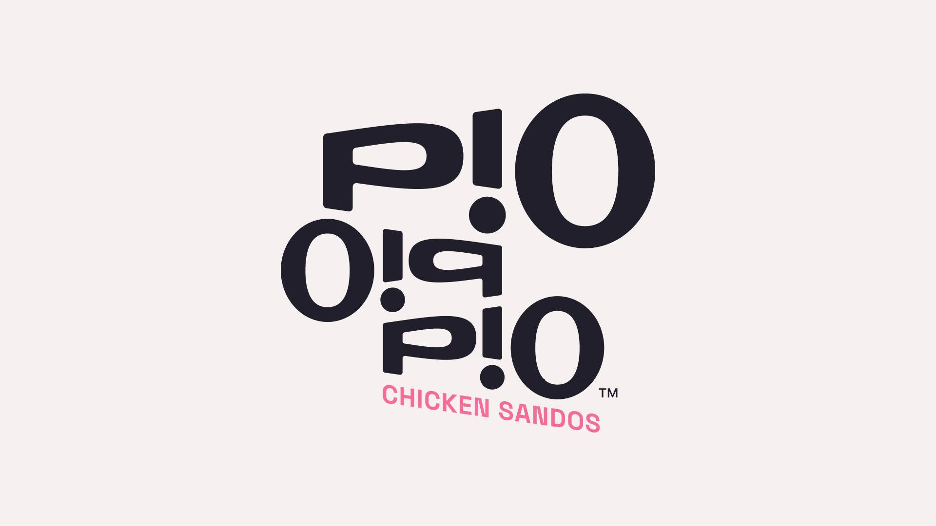
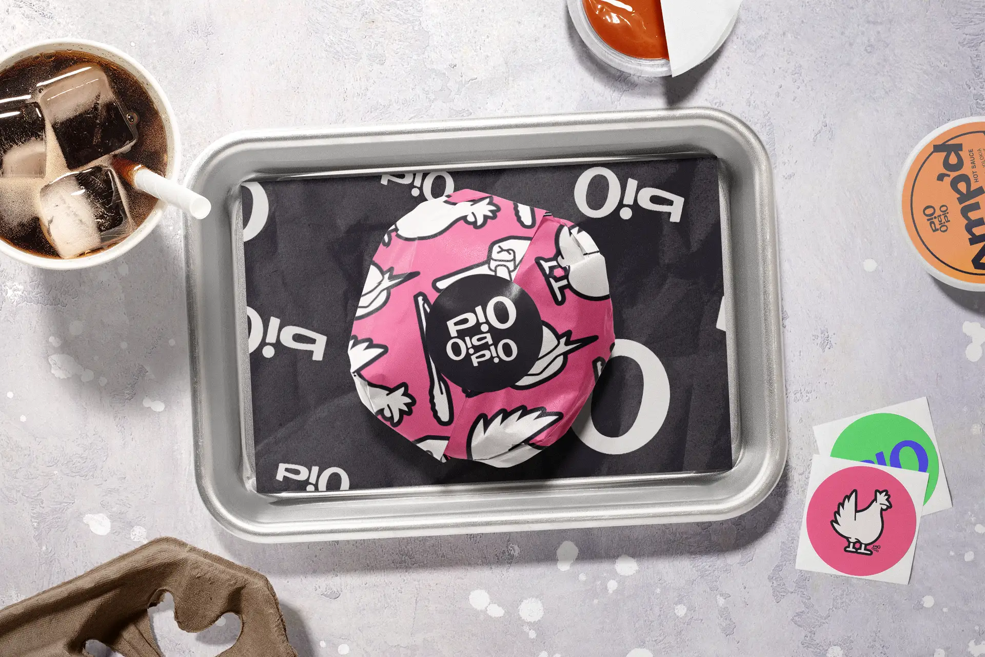
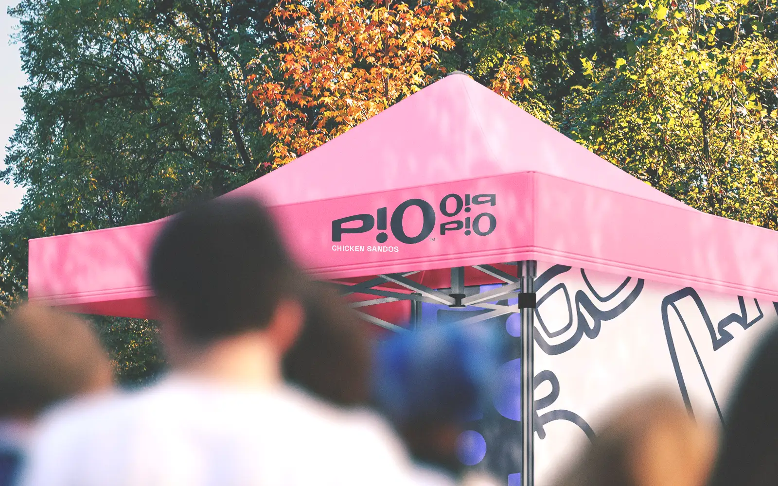
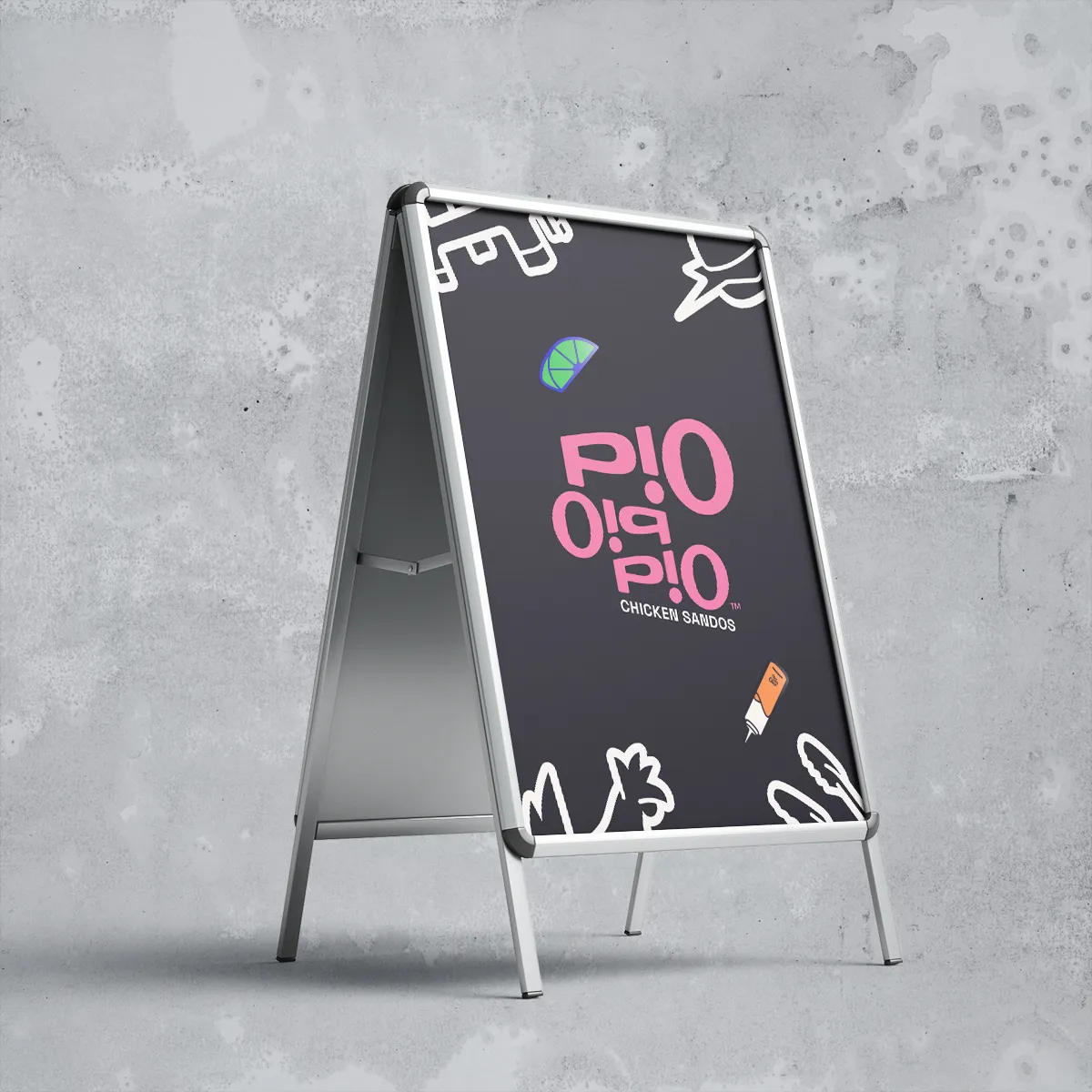
Instead of the typical chicken mascot beckoning to “eat me,” Pio’s logo emits the sound and energy of commotion. Backwards type? Nah, it’s conversation. And like the reversal, each “i” cycles from letter to accent to exclamation; whether you read P!O as three letters or two, it demands to be said aloud. The lockup's repetitive nature expands the logo into a visual shorthand as singular as a monogram and as expansive as a pattern, guaranteeing mindshare for the new restaurant.
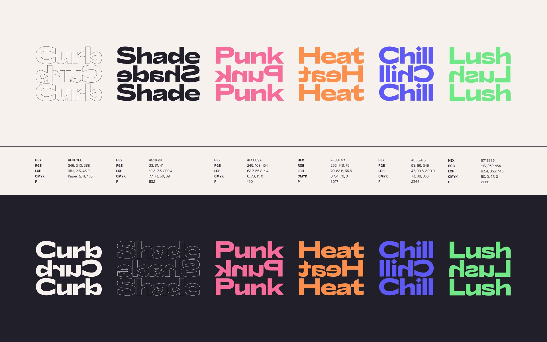

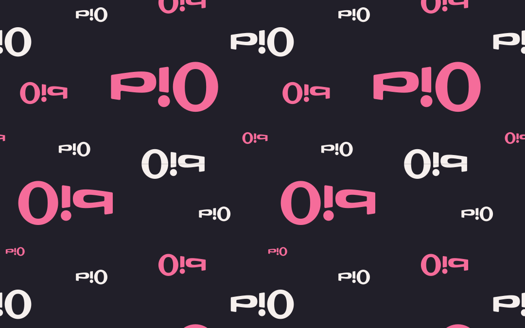
Close your eyes and think of color in a busy market: clashing tones, buzzing neon—even the gum stuck to the pavement. Instead of focusing on the fryer, Pio Pio Pio’s colors paint with the palette of their scene.
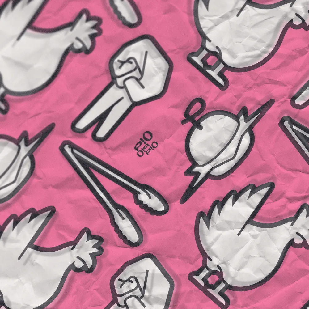
In a sea of reds and oranges, we flew the coop for a bubbly, punk rock pink that more traditional birds might bristle at. Strong baseplates of dusty-white Curb and cool-black Shade anchor the larger palette beyond Punk too, hosting a slushie blurple, saucy orange, and glowy green. No ketchup or mustard here.
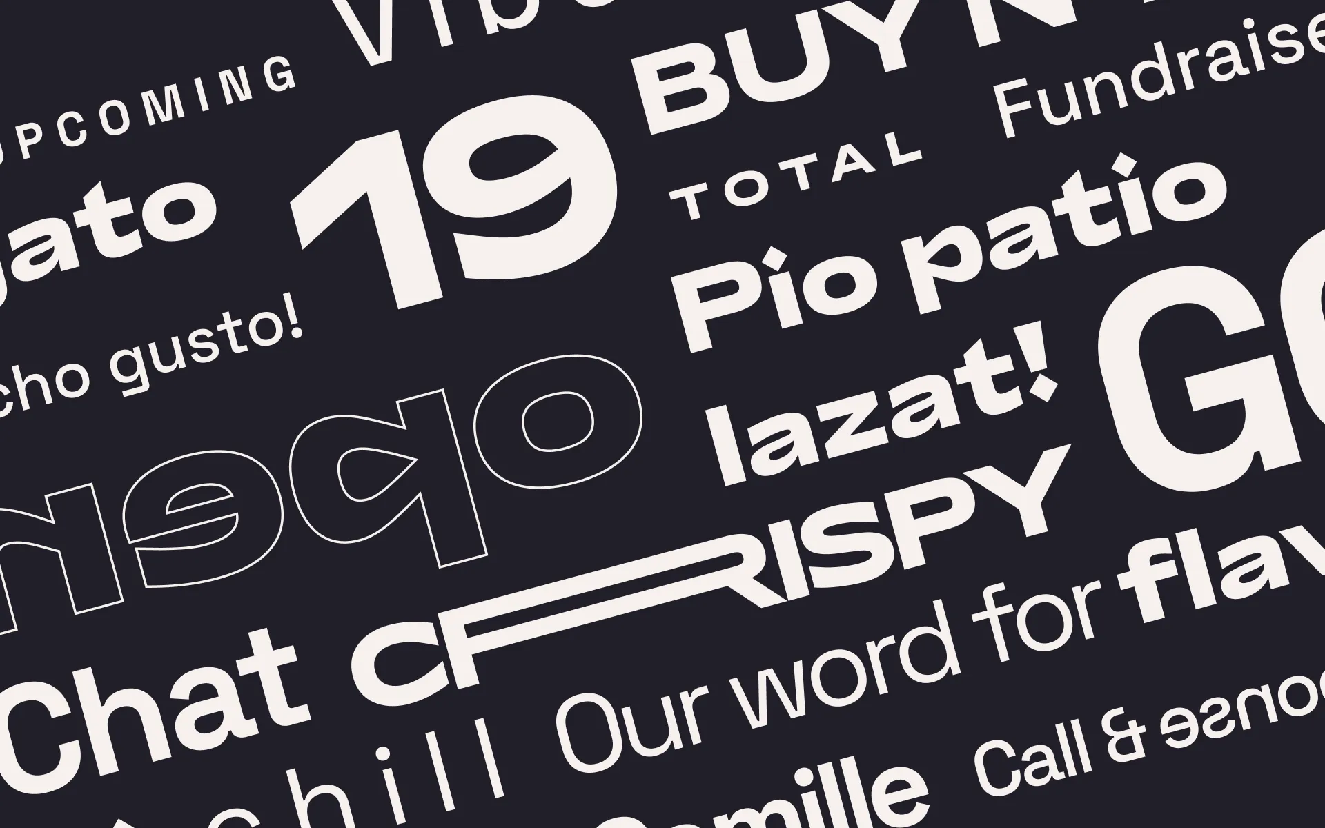
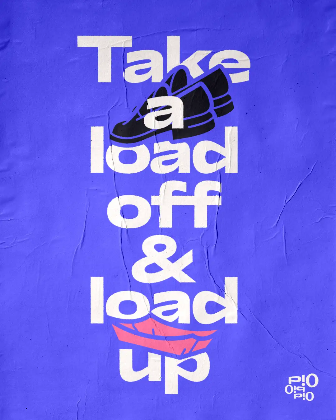
Finding Pio’s voice in type came from a few angles. I landed on a pairing of Lyyra Extended, the most dramatic weight from a family whose shapes and impact matched the logo’s volume, and Space Grotesk, a funky sans that felt like the perfect nod to DIY ingenuity with professional precision.
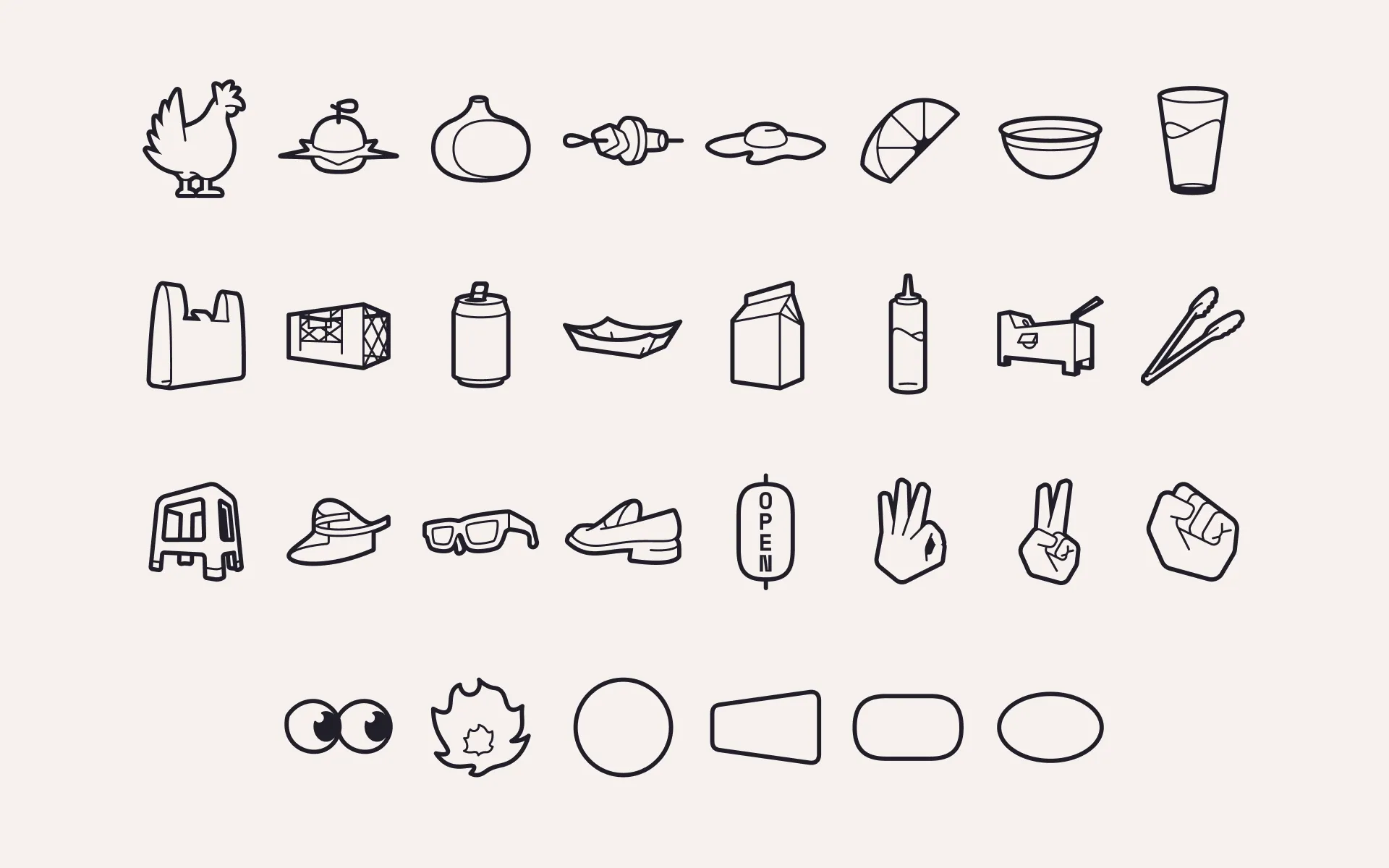
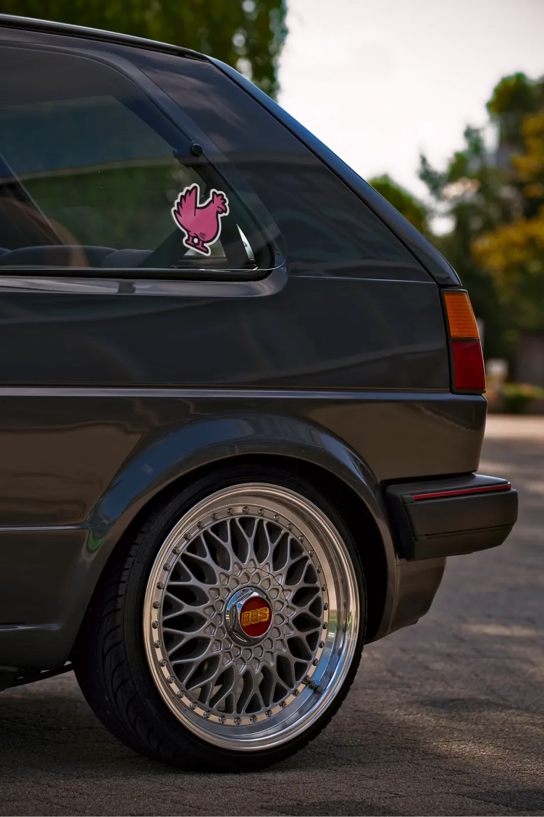
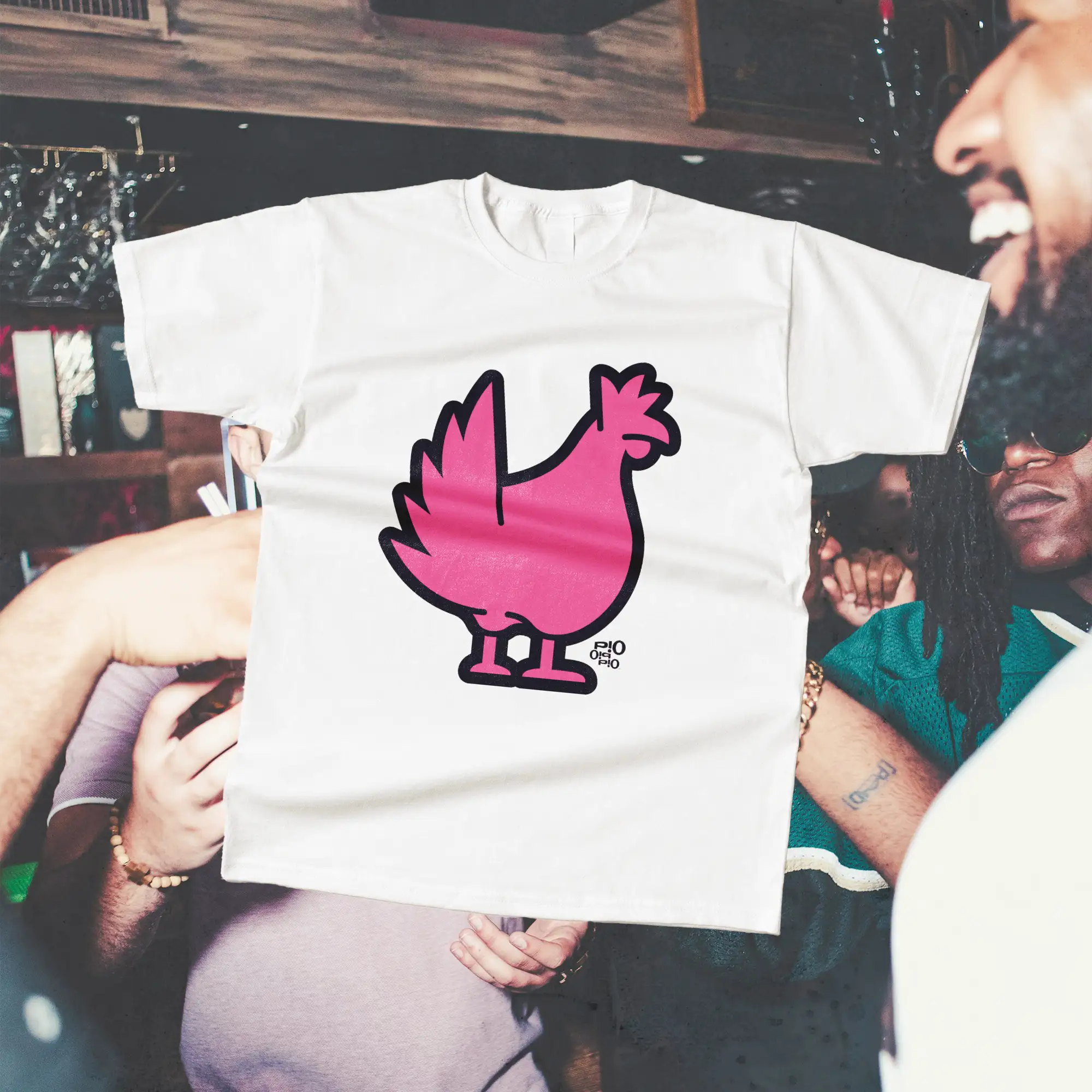
If Pio Pio Pio did have a mascot, it’d be the badass mohawk-spiked hen from the identity’s flexible sticker pack. One of thirty, they give the Pio team and their community an easy on-brand way to customize anything from takeaway seals to sneaky bar bathroom tags.

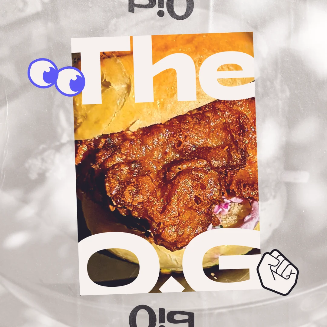
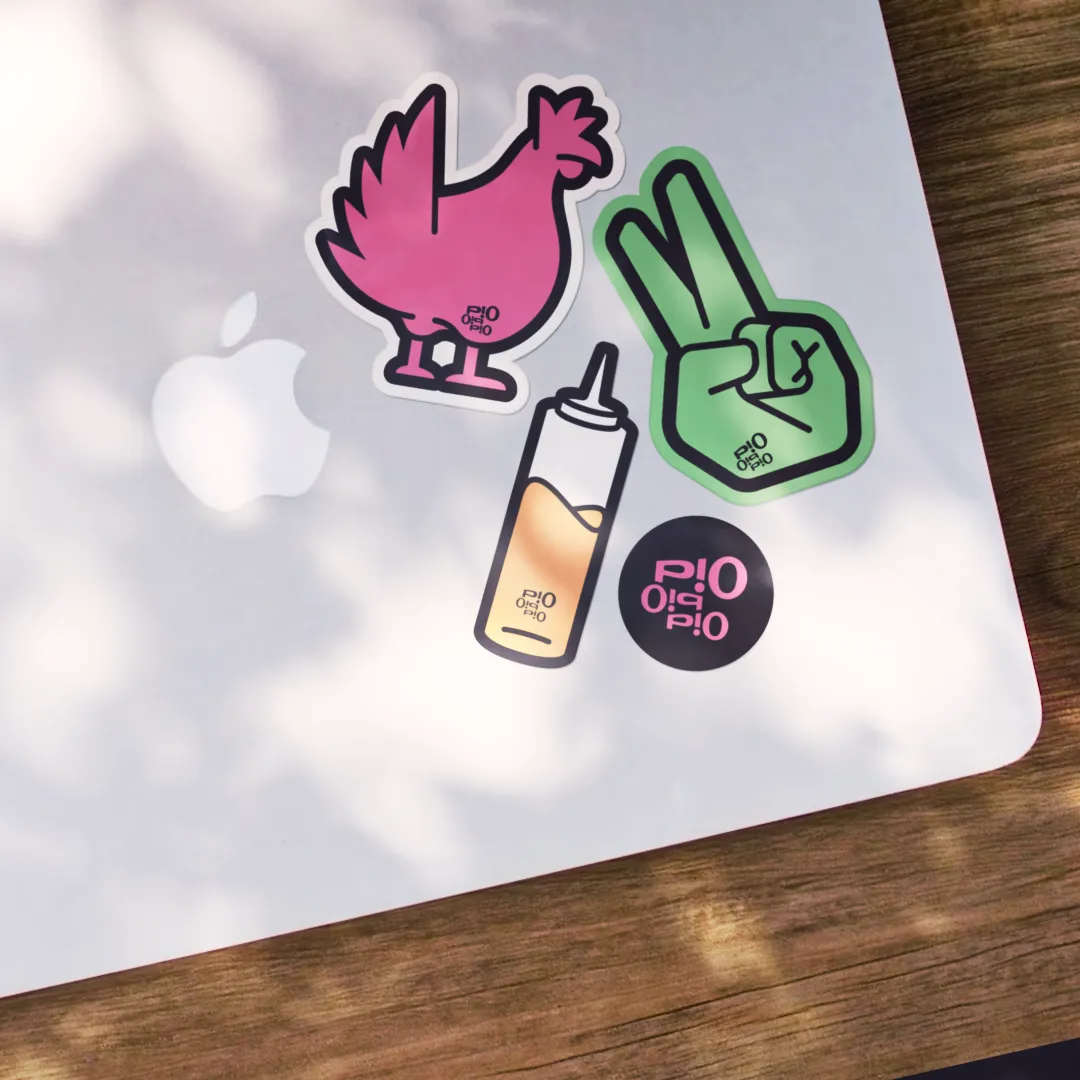
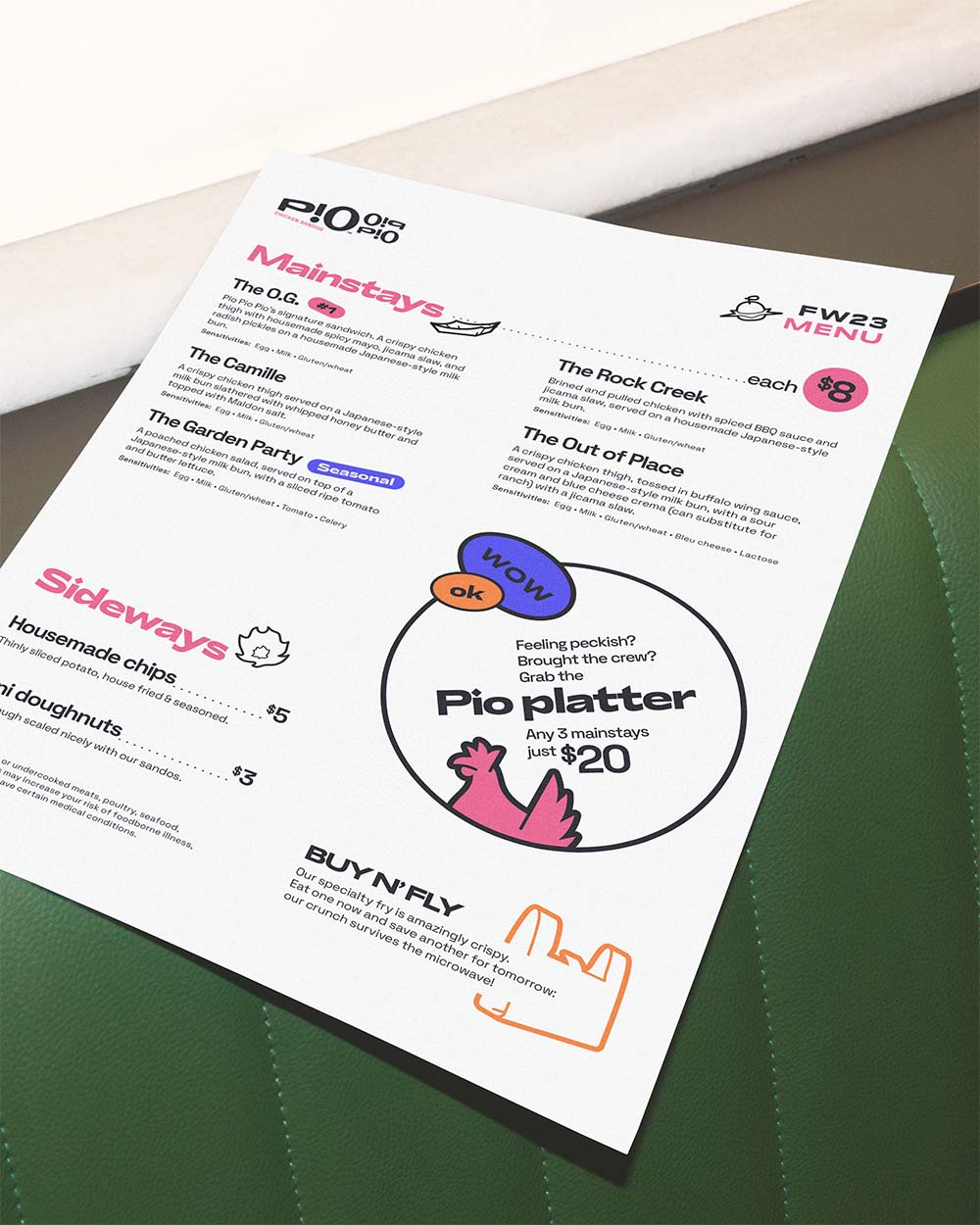
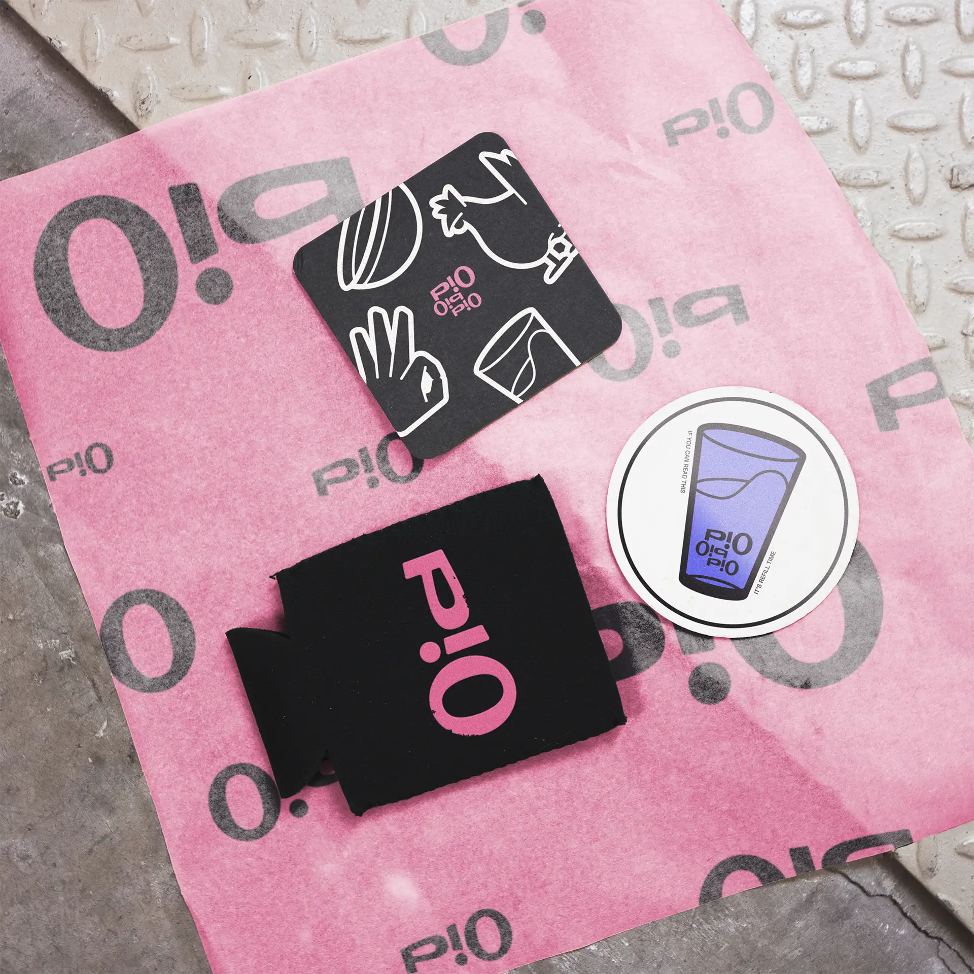
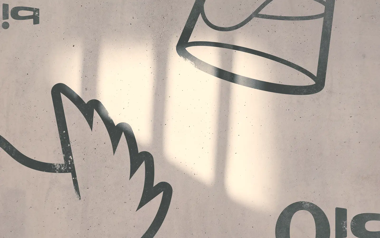
But the spice didn’t stop there. Extracting design choices from the logo, the type and graphics gain additional powers through motifs. Repetition, reversal, and rotation all give fresh ways to bring layout itself into the Pio-verso.
Finally, physical textures and treatments ground all the commotion, giving it a sense of place that calls us back to the physical space for gathering, as opposed to being a digital one. Pio Pio Pio isn’t a perfect place, it’s a creative one. Tempering the edge adds to it.
Web
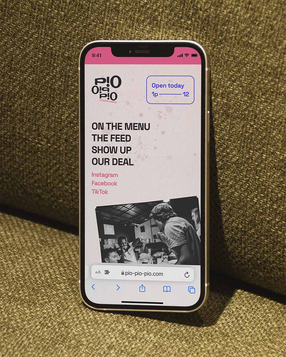
From the jump both Ward and Ang recognized the value of a confident, up-to-date web presence. Pio Pio Pio’s single-page drop combines all the flavor of its personality with fast access to the info patrons need. One special twist is The Feed, which acts as a digital pinboard for the team to highlight specials, events, and other updates for visitors not entering from a social channel.
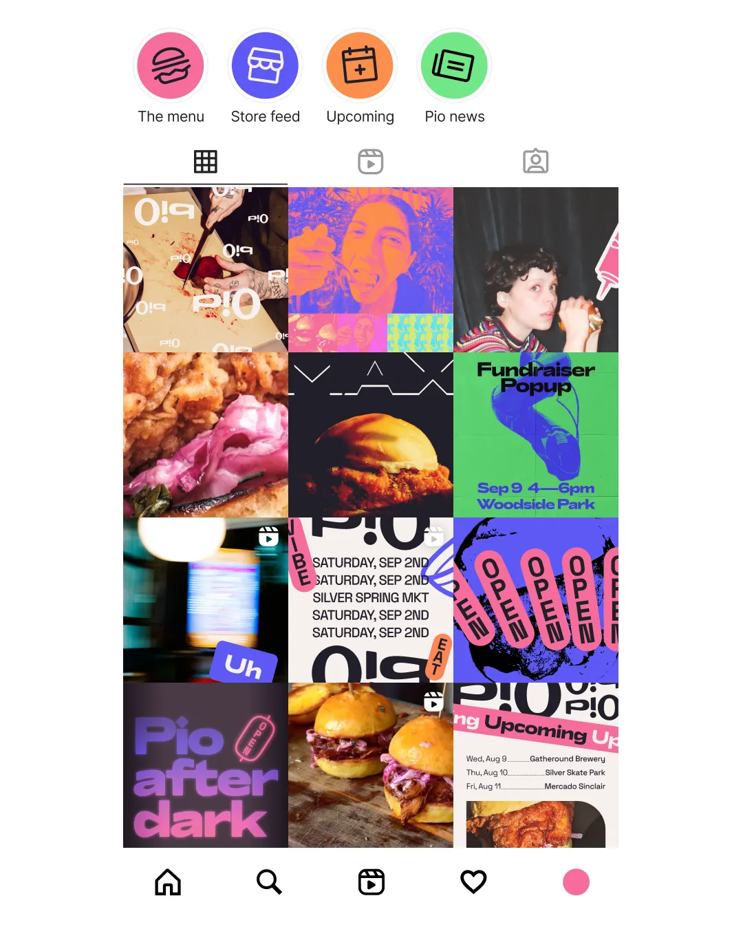
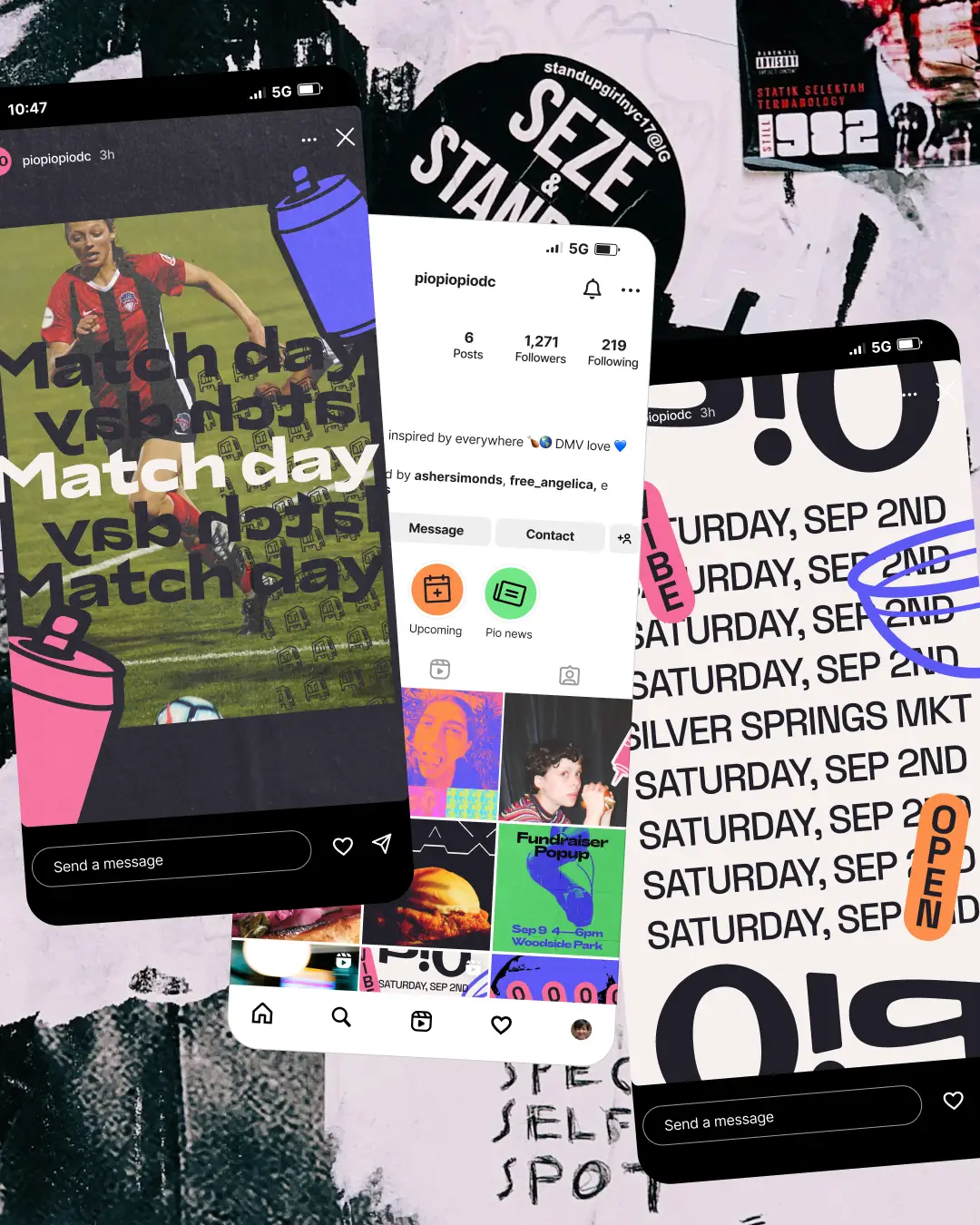
As a whole bird, the Pio-verso system gives the team space for experimentation and wrongness without worry of inconsistency. Design can also sit naturally next to more ad-hoc, spontaneous, or otherwise informal content which gives the team flexibility in their work.
All eclectic, eccentric, and not really what a proper friend chicken spot should look like. But like street food with your friends, the best visits are the ones that surprise you.