IDEAA
- Who
VP, Creative for IDEAA, a nonprofit providing tech education
- What
An brand identity to fit an updated mission and potential
- How
Understanding the grassroots culture of the team and its community
- Impact
Its flexibility and legitimacy helped grow the annual event schedule from 1 to 4, in turn growing first-year total attendance by 60% and connecting 30+ sponsors
- Creative direction
- Art direction
- Graphic design

Brief
IDEAA’s secret recipe: mix community energy and developer education in a bowl until well blended.
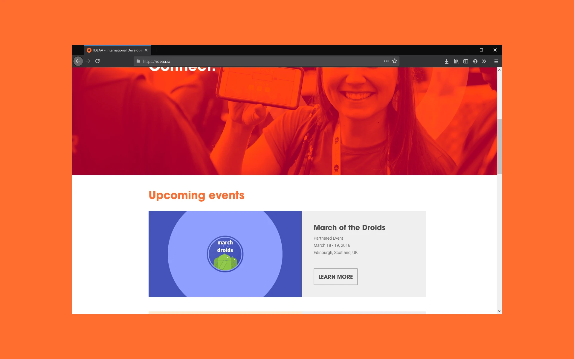
Beginning with a backyard barbecue, the company-now-nonprofit (International Developer Education and Advocacy Alliance) had grown into a network of grassroots tech events that blurred the line between convention and conference. Attendees learned, played, and ate together while exploring the future of mobile devices.
After repeated success with the Big Android BBQ, organizers reestablished themselves as IDEAA in 2015. This opened up new topics, event styles, and sponsorship opportunities. The team asked me to remix the BABBQ’s spirit into a platform-agnostic identity to surround their events. We created a system that reflected the hope, joy, and imagination inside each attendee.


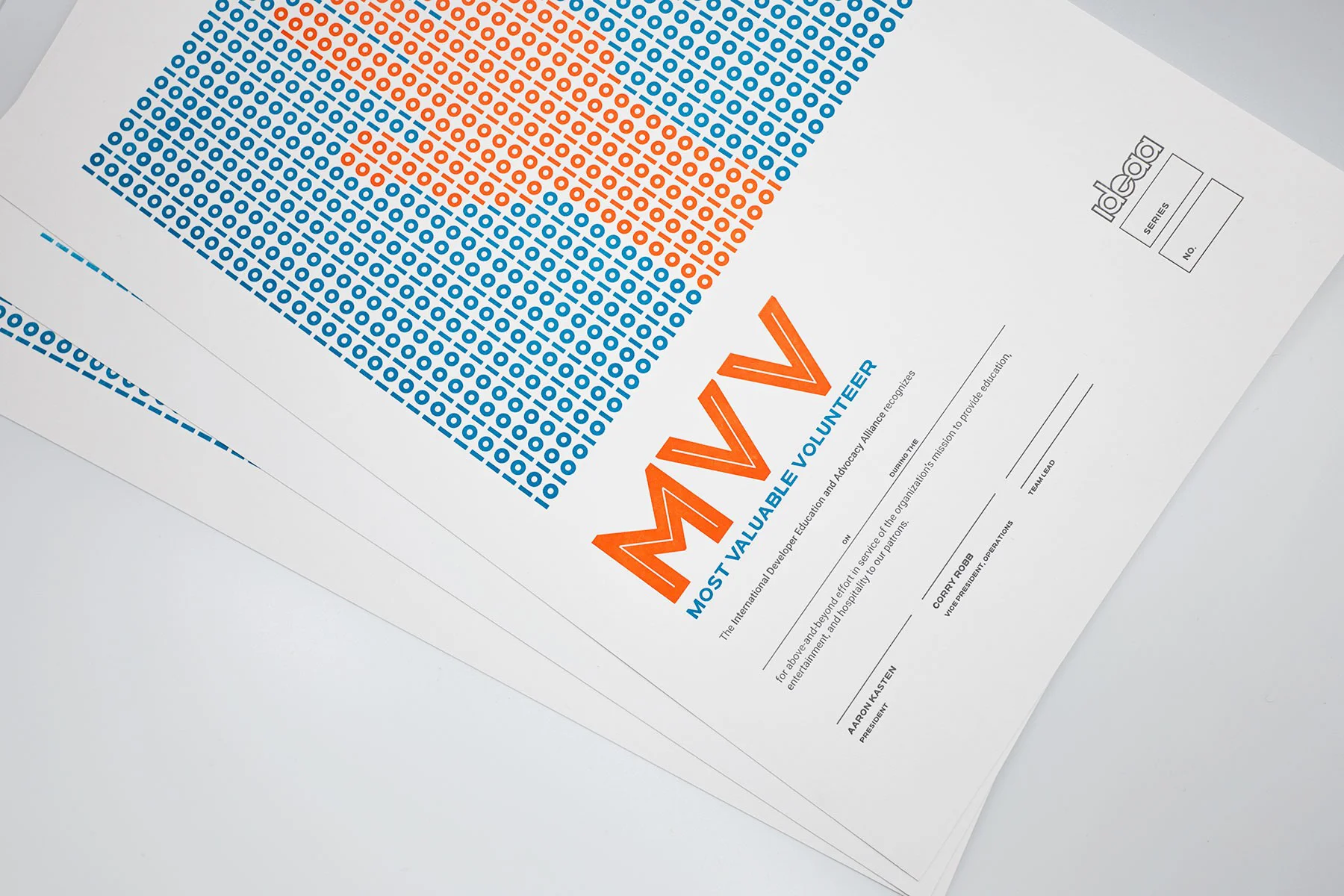
IDEAA events feel local. They’re run by people who would otherwise pay to attend. Bottling this enthusiasm balanced the formal strength IDEAA’s new name carried. A lively color palette sits aside the binary motif creating the logo in lowercase. These humble 1’s and 0’s form the fabric of everything in the identity, just as they would in an attendee’s first "Hello, World" app. Focusing on the small gives this system its largest opportunities.
The new freedom of an identifiable parent helped IDEAA transfer brand equity it gathered from its single annual event, the Big Android BBQ, to a now-possible portfolio of 4 domestic in its first year with one additional produced by a 3rd party in Europe. This grew total first-year tickets to nearly 1500 (not counting satellite)—a 60% jump—and allowed the nonprofit to deepen relationships with the dozens of sponsors (such as Google, Facebook, Cyanogen, Oppo, Honda, Nvidia, ASUS, etc) across new properties.